


15 CSS Habits to Develop for Frustration-Free Coding
1. Use a Reset Stylesheet
This habit (along with a few others) is one frequently mentioned as a CSS best practice. The goal of a reset stylesheet is to reduce inconsistencies among browsers by explicitly setting styles to most of the HTML elements. This ensures that things like font sizes and line heights all render the same on different browsers. Also, the reset clears the default paddings/margins that some browsers have.
Not only does having a reset stylesheet account for browser inconsistencies, it’s good to use them to give each site a known foundation when coding. Keeping the foundation the same for all sites will speed along the development.
The reset from Eric Meyer and the Yahoo reset are the most comment resets used. Futher customizing one of those resets might be needed to accomodate for specific website needs.
2. Use CSS Shorthand
Using shorthand CSS declarations will lead to quicker coding and debugging. It might also save some errors from mistyping multiple declarations.
When a rule has multiple similiar declarations for a single selector, such as
border-top: 5px; border-right: 10px; border-bottom: 15px; border-left: 20px;
they can be combined into one line, such as
border: 5px 10px 15px 20px;
The trick to remember which position controls which direction is TRouBLe: Top, Right, Bottom, Left.
The main declarations that use shorthand for are border, margin, padding and background.
Bonus: Hex Shortcut
Six hexidecimal digits used for CSS colors can be condensed down to three if they are grouped in identical pairs.
For example, #FFFFFF can be written #FFF, or #990055 can be written #905, but #F091A4 cannot be shortened since the pairs aren’t identical.
3. Document Your CSS … As You Go
Going back and commenting code is one of those quixotic things that most fool themselves into thinking they will do. Get in the habit of making good commenting practices while writing styles.
To add a comment in CSS it’s as simple as putting /* Your Comment Here */
Things to comment
Stylesheet Header
This comment briefly states what the stylesheet is for, who wrote it and when. A table of contents might also be needed for larger stylesheets.
Code sections
Put a comment header above large portions of code for things like global styles, headers, sidebars, main content and footer to help delineate them.
For example,
/****************************************/  /*             Sidebar
           */  /****************************************/
Problem declarations
Put comments next to declarations that have know issues in certain browsers, such as
input[type=textbox] /* IE6 Problem */
Dependent declarations
Put comments next to things that are dependant on other areas. So if there is a fixed height on a declaration that might need to be adjusted if the content changes, put a small comment next to it, stating what conditions must happen before it will need to adjust.
4. Add a Color Legend
When working on smaller CSS files, keeping track of color hex values isn’t too hard. But as stylesheets start getting 2000+ lines it becomes significantly harder to keep track of which value is for which color. Adding a color legend helps ensure that the wrong colors don’t get used.
The best place for the legend is up in the stylesheet header, underneath all of the other documention.
For example,
/*  /* light blue: #4595be  /* dark blue: #367595  /* special link red: #9F1212
 ********************************/
5. Remember Where Absolutely Positioned Elements are Relative To
Positioning elements absolutely is something that tends to frighten some CSS beginners, but there is one principle to remember with this declaration that solves most of the trouble.
When a selector has a postition: absolute declaration the webpage is treated like a xy grid. By default, the 0,0 position of the grid is at the very top and left position on the webpage. So by moving the absolutely positioned element to the left 10 pixels and from the top 20 pixels, it’s starting from the top left of the webpage, regardless of where the element sits in the HTML.
That is not usually the desired functionality. What usually is desired is to have the element positioned relative to the selector’s parent or another containing element. To do that simply add position: relative to the desired relative container element. Doing that remaps the 0,0 position on the xy grid from the top of the webpage to the top left of the containing element.
The example below demonstrates how the red box gets positioned differenlty depending on whether the blue container has position: relative or not.
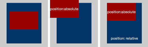
Remembering position: relative should ease most frustrations caused by basic absolute positioning.
6. Avoid Using CSS Hacks
Unfortunately for web designers, there are bugs in some browsers, mainly IE6 and IE7, that cause some styles not to display as they are supposed to in accordance with CSS specifications. In order to combate these inconsistencies, some people write erroneous declarations, hacks, that take advantage of these browser flaws in order to do things, such as hide styles from particular browsers
There are many fancifully named hacks for all the equally fancifully named CSS bugs, but using them can cause problems. Not only do hacks clutter the stylesheet with oddball declarations, it also keeps the stylesheet from validating.
Also, hacks tend to introduce more problems overtime as new browsers are released.
Instead, use conditional stylesheets to target specific browsers.
7. Use Margins When Styling Layouts
Although this habit isn’t one often mentioned, it’s one that helps maintain a consistent layout among different browsers without having to add more declarations to get them all in sync.
The main idea is that instead of adding padding to a container element, add margin to the container’s children to get the same result.
So, instead of
#main-content { padding-left: 10px }
add
#main-content { } #main-content #left-column { margin-left: 10px }
Although there is nothing particularly wrong with using padding, in my years of building websites I have had consistenly fewer cross-browser problems when I stick with styling layouts with margin.
8. Contain Floats
When floating an element, add overflow: hidden to its containing element.
A common example is,
ul { overflow: hidden; } ul li { float: left; }
If the container didn’t have overflow:hidden issues arise when setting margins or borders to it. This also clears the float so that elements below it can flow properly in the HTML structure.
Some suggest doing the clear in HTML by adding
<div style="clear:both"></div>
below the floated element, but doing that defeats the purpose of separating a webpage’s style and structure.
It’s also more time consuming than adding overflow: hidden.
9. Add display: inline To Floated Elements
This habit is one that fixes a IE6 problem called the double-margin bug without having to use a CSS hack. On floated elements, IE6 doubles the margin of the element. So a margin of 10px becomes 20px.
It’s easy to imagine the havoc an error like this can cause to a layout. Some of the floated items either become hidden or they push everything below it down.
Even though IE6 is on its way out and a majority of designers aren’t taking the time to get sites looking perfect in IE6, this is a quick habit to learn to make a site better viewed for those poor people still on IE6.
Just get in the habit of adding
display: inline /* IE6 Problem */
every time something is floated.
10. Get Comfortable with Sprites
Sprites mask the viewable space of a larger image, then when an event occurs, typically a :hover event, the viewable space of the image changes to show another portion of the image.
Not only are sprites more efficient by requiring fewer HTTP calls for images, but they add more polish to website designs. Most often sprites are used to create stylish navigation menus.
Using sprites in a design might take a bit of trial and error to get the hang of it, but it’s such a valuable skill to have that it’s worth the effort required to get the concept down
Further Reading
11. Have a Consistent File Structure
Take the time to create and organize all of the typical files used for a typcial website development project. Create one master template file structure and copy/paste it every time a website needs to be built.
My organization is as follows:
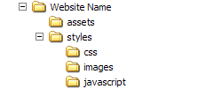
The ‘Website Name’ folder gets renamed to the website name that I’m about to begin work on. That folder contains all of my HTML files for the site, along with the ‘assets’ and ‘styles’ folders.
The ‘assets’ folder typically holds larger document files like PDFs that might need to be downloaded from the site. I also keep editible versions of images I’m using, such as PSDs or Fireworks PNGs, in case I need to modify something.
The ‘styles’ folder is broken into the three subfolders: css, images, javascript.
- css – holds all the css files, such as reset.css, layout.css and main.css
- images – holds all the images for the site
- javascript – holds javascript libraries, plugins and main.js
I use this file structure for most of my webpages and because I’m consistent I know exactly what paths to use when needing to do things, such as put a background image in my CSS.
Some might disagree with my structure, such as having javascript under ‘styles’, but the main point is find a file organization that works for you and get in the habit of consistently using it to make coding faster and more accurate.
12. Indent Your Styles
Adding indentation to a stylesheet can keep complicated stylesheets looking clean and make finding areas of code easier. Add indents to show a parent/child hierarchy.
13. Use Pixels for Font Sizes, Not Ems
This habit is usually a hot button topic with most people having a strong opinion for either fixed font sizes or relative ones.
In hopes to curtail a probably backlack, let me plainly state, “Using a fixed font size, like pixels, leads to fewer CSS frustrations than using a relative font size, such as ems or %.”
In his article Coding Like It’s 1999, Cameron Moll petitions for pixels and says,
The burden of calculating relative units throughout a CSS document is replaced by the convenience of absolute units
Relative font sizes were a good idea a few years ago so that people with different browser font sizes could have a site’s content adjust to their browser’s font size. But now most browsers can zoom and adjust more intelligently so a relative measurement isn’t neeed for that purpose anymore.
Relative measurement becomes a problem because the font sizes inherit the parent’s measurement as it cascades down.
For example, body { font-size: 62.5% } makes a font-size: 1em declaration equal to 10px.
If #blog-content needs to be 14px, the rule is
#blog-content { font-size: 1.4em; }
Now the if the H3 tag inside of #blog-content needs to be 20 pixels, one might assume
#blog-content { font-size: 1.4em; } #blog-content h3 { font-size: 2.0em }
would be right, but that’s where the relativity problem occurs. Because that 2.0em is now relative to the 1.4em specified on #blog-content, so it is actually font size of 28px.
Keeping up with relative font sizing can get confusing. Stick to using a fixed unit of measure for font sizes to prevent undue troubles.
14. Limit Pseudo Classes to Anchor Tags
Most modern browsers don’t struggle with this problem, but it is an important one to remember if a website still needs to be viewable on older browsers, such as IE6.
The problem is that older browsers only recognize pseduo classes, like :hover, on the anchor tag element, a.
So something like
#header ul li:hover { background-color: #900 }
won’t work in IE6.
This issue could cause real functionality problems, if things like dropdown menus are to appear based on the li:hover event. People viewing the site on IE6 would never see the dropdown and thus, might have a hard time navigating the site.
A solution is to use jQuery for those types of effects.
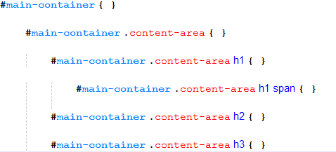
15. Avoid Selector Issues
Be sure selectors have enough weight to prevent unwanted cascades.
The way the browser determines what style is to be applied to an element with multiple declarations is determined by its specificity
The more specified a CSS selector is the more weight that rule carries. The rule with the heaviest weight is the one that gets applied to the element
If some rules are being applied as desired, check to see if the problem is with its specificity. It might be as simple of a solution as adding an #id-name to the beginning of the selector.
Use element selectors when possible.
Instead of
main-content .main-header
use
#main-content h1
Be careful when grouping selectors.
Grouping selectors can be a time-saving method when dealing with non-relative declarations, like
.main-content div, .main-content p { color: #000; }
But it can cause trouble when using a relative declaration, such as
.main-content div, .main-content p { line-height: 1.3em; }
Because now all of the text within the div gets a 1.3em line-height applied to it, but now any p elements within a div get an additional 1.3em added to them.
Also, sometimes grouping multiple selectors can add more weight to them than is desired, which in turns causes other desired styles not to take place.
* Write Better HTML
Bonus Tip! A great way to become a better CSS coder is to improve your HTML coding.
Avoid div-itis by wrapping divs around everything. Learn to style the elements with element selectors, such as h1, ul and p.
Use a proper DOCTYPE to avoid sending browsers into quirks mode.
Try to code as much HTML as possible before adding any styles. Doing this brings more thought to the overall structure of the webpage and causes syntax problems to be spotted and fixed instead of covering them up with styles.


